


How do people feel about some of the biggest logo changes of last year? Do they like the revamped version or the previous look?
To find out, Visual Objects surveyed 1,000 consumers in the United States on whether they prefer the new or old version of the corporate logos of six brands that conducted redesigns in 2019: Facebook, Yahoo, Slack, Zara, Sears, and Lord & Taylor.
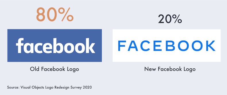
Some 80% of consumers prefer Facebook’s old logo, and 20% prefer the new logo. (Note that the old logo, which served as both a corporate logo and the logo of the company’s social media platform, is still in use—but only as the logo of the platform, not the company.)
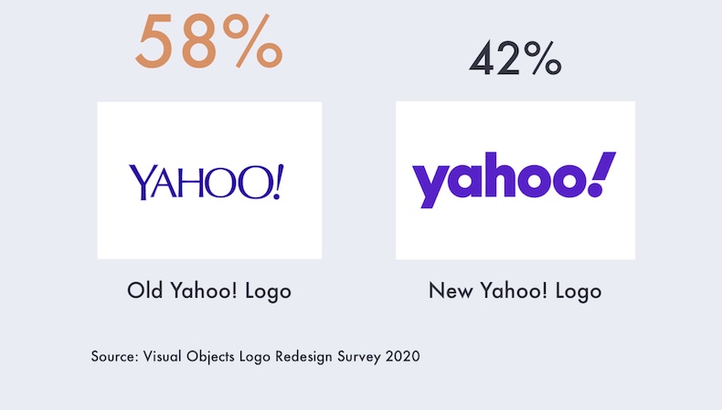
Yahoo
Some 58% of consumers prefer Yahoo’s old logo, and 42% prefer the new logo.
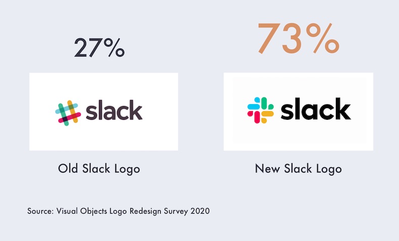
Slack
Some 27% of consumers prefer Slack’s old logo, and 73% prefer the new logo.
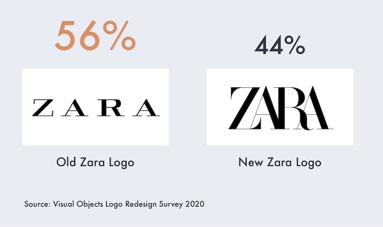
Zara
Some 56% of consumers prefer Zara’s old logo, and 44% prefer the new logo.
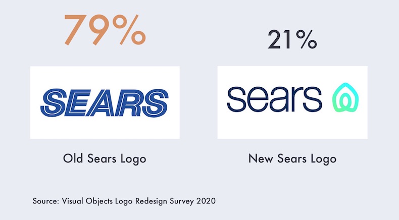
Sears
Some 79% of consumers prefer Sears’s old logo, and 21% prefer the new logo.
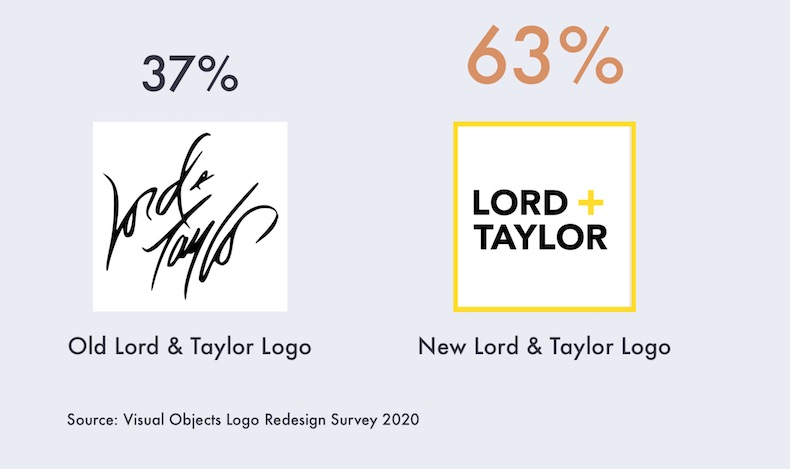
Lord & Taylor
Some 37% of consumers prefer Lord & Taylor’s old logo, and 63% prefer the new logo.
About the research: The report was based on data from a survey of 1,000 consumers in the United States.