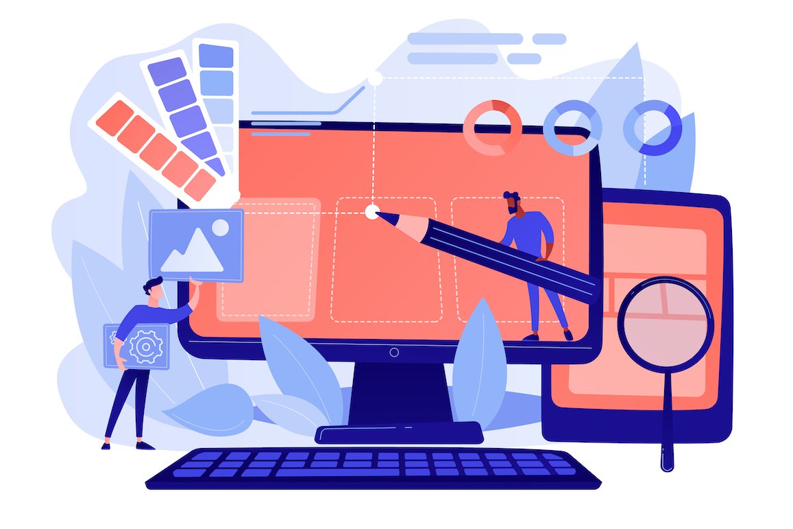
Website design is an essential aspect of creating a successful online presence. It involves designing and developing web pages that are visually appealing, easy to navigate, and provide relevant information to the user. Website designers use website builder software such as WordPress or Bootstrap to create web pages and sites.
When building a website, selecting a domain name is the first step in establishing an online presence. Once you have chosen your domain name, you can begin selecting website templates that best suit your needs. Website builders offer a wide variety of templates to choose from, making it easy for anyone to create a professional-looking site.
Once you have selected your template, it’s time to start adding site content. A well-designed website should have clear and concise web pages with relevant information for the user. This includes details about your products or services, contact information, and any other pertinent information that may be helpful for visitors.
One essential component of any website is a contact form. This allows users to get in touch with the development team or site owner if they have any questions or concerns about the site. A contact form should be easy to find on the site and straightforward to use.
What is Website Design?
Visual Appeal: The Importance of Website Design
Website design is crucial in making a website visually appealing and user-friendly. A well-designed website can attract visitors and keep them engaged, while a poorly designed one can turn them away. Visual appeal plays a significant role in the success of a website. Visitors are more likely to stay on a site that is visually pleasing, easy to navigate, and provides relevant information.
A web design company employs the best website designers who have the skills and expertise to create websites that meet the needs of their clients. These designers use various tools such as color schemes, typography, images, and videos to make websites visually appealing. They also ensure that the website’s design is consistent with the client’s brand image.
User-Friendliness: Making Websites Easy to Navigate
Website design also involves creating a user-friendly interface that allows visitors to navigate through the site easily. A well-designed website should be intuitive and easy to use, allowing visitors to find what they are looking for quickly. This is achieved by using clear navigation menus, breadcrumbs, search bars, and other features that help users find their way around.
The best website designers understand how important it is to create an interface that works seamlessly across all devices. With mobile devices accounting for over half of all internet traffic worldwide, it’s essential that websites are optimized for mobile devices as well as desktops.
Functionality: Ensuring Websites Work Properly
Design plays an essential role in ensuring that websites function correctly. A poorly designed site can lead to slow load times or broken links which can negatively impact user experience. The best website designers ensure that websites are optimized for speed and performance by using clean code and optimizing images.
In addition to this, web design companies also provide ongoing maintenance services to ensure that websites continue working correctly after launch. This includes regular updates and security patches which help prevent hacking attempts or other security breaches.
Creating an Online Persona: Reflecting Your Brand Identity in Your Website Design
Consistency is key and should effectively communicate your brand identity to people who visit your site. A well-designed website can enhance your online marketing efforts by increasing brand awareness and attracting potential customers.
When creating your website, it’s important to consider how it will be perceived by people. You want to ensure that it accurately represents your brand and that the overall design is visually appealing. This means taking into account the color scheme, typography, imagery, layout, and overall user experience.
Color Scheme
The color scheme you choose for your website can have a significant impact on how people perceive your brand. Different colors evoke different emotions and can help create a specific mood or feeling for your site visitors. For example, blue is often associated with trustworthiness and professionalism while red can evoke feelings of excitement or urgency. It’s important to choose colors that align with your brand values and messaging.
Typography
The typography you use on your website can also play a role in establishing a consistent online persona. The font you choose should be legible and easy to read across all devices. It’s also important to consider the style of font you use as this can contribute to the overall tone of voice for your brand.
Imagery
Images are another important aspect of website design that can help establish a consistent online persona. The images you use should align with the messaging and values of your brand while also being visually appealing to site visitors. High-quality images are essential for creating a professional look and feel for your site.
Layout
The layout of your website plays an important role in determining the user experience (UX) for site visitors. A well-designed layout should be intuitive and easy to navigate so users can find what they’re looking for quickly and easily. It’s also important to consider the placement of key elements such as calls-to-action (CTAs) and contact information.
Social Media
Social media can be a powerful tool for promoting your website and further establishing your brand identity online. By sharing content that aligns with your brand messaging and values, you can increase brand awareness and engage with potential customers. It’s important to choose social media platforms that are relevant to your target audience and consistently share high-quality content.
Essential Elements of Website Design: Links, Navigation, and Menu
Navigation Menu: The Backbone of Website Design
Navigation menu is the backbone of website design. It is the first thing that users see when they land on a website, and it guides them through the site. A well-structured navigation menu with clear options can enhance user experience. Navigation menus are essential elements of website design that help users find what they are looking for quickly and easily.
Links: The Building Blocks of Navigation
Links play a crucial role in guiding users through the website. They are the building blocks of navigation menus, and they connect different pages on a website. Links should be used wisely to ensure that users can navigate through the site without getting lost or confused.
When creating links, it’s important to use descriptive anchor text that accurately reflects the content of the page being linked to. This helps users understand where they will be taken when they click on a link. Links should be visually distinct from other text on the page so that users can easily identify them.
Elements: Buttons and Blocks
Buttons and blocks can be used to highlight important elements on the website. These elements provide visual cues to guide users towards specific actions or information. For example, buttons can be used to encourage users to sign up for a newsletter or make a purchase.
Blocks can also be used effectively in navigation menus to group related items together visually. This helps users understand how different sections of the site relate to one another and makes it easier for them to find what they’re looking for.
Images: An Important Element in Navigation Menus
Images can also be used as an element in navigation menus to make them more visually appealing. Images can help break up large chunks of text and provide visual interest while still conveying important information about where each link leads.
However, it’s important not to overuse images in navigation menus as this can slow down page load times and make it harder for search engines to crawl your site.
Structure: Keep It Simple
Simplicity is key. A well-structured navigation menu should be easy to understand and use. Navigation menus should be organized logically with clear categories and subcategories that make sense to users.
It’s also important to keep the number of options in your navigation menu to a minimum. Too many options can overwhelm users and make it harder for them to find what they’re looking for.
Options: Provide Multiple Ways to Navigate
While a well-structured navigation menu is essential, it’s also important to provide users with multiple ways to navigate through your site. This includes using internal links within your content, providing a search bar, and including related articles or products at the bottom of each page.
By providing multiple ways for users to navigate through your site, you can ensure that they find what they’re looking for quickly and easily.
Usability and Engagement: Using Design Elements to Enhance User Experience

Usability is key to enhancing user experience
In today’s fast-paced world, users expect websites and applications to be intuitive and easy to use. Usability is the key to enhancing user experience. Websites that are difficult to navigate or have confusing layouts can lead to frustration and ultimately drive users away. To improve usability, designers should focus on creating a clear and simple interface that is easy for users to understand.
Design features should be tailored to the needs of users
Design features should be tailored specifically to the needs of users. Designers must take into account the target audience when designing a website or application. This means considering factors such as age, gender, interests, and technical ability. By tailoring design features to meet the specific needs of users, designers can create an engaging user experience that keeps visitors coming back.
A positive user experience can lead to increased engagement with the product
A positive user experience can lead to increased engagement with a product or service. When users have a good experience using a website or application, they are more likely to spend more time on it and return in the future. This can result in increased conversions and revenue for businesses.
Customer service should be integrated into the design to provide a seamless experience
Customer service should be integrated into the design of websites and applications. Providing customer support through chatbots or live chat options can help ensure that customers receive timely assistance when they need it most. Integrating customer service into the design also creates a seamless experience for users who may need assistance while using the product.
Custom drag and drop features can improve usability and engagement
Custom drag-and-drop features are an effective way of improving usability and engagement on websites or applications. These features allow users to easily move elements around on a page without having to use complicated menus or navigation tools. Custom drag-and-drop features also make it easier for users with limited technical ability or mobility issues.
Effective Writing and Communication in Web Design
White Space: The Importance of Proper Use
White space is an essential element that can make or break the user experience. White space refers to the empty areas between text, graphics, and other elements on a webpage. It gives a sense of balance and harmony to the overall layout of a site.
Proper use of white space can help guide users’ eyes through the page and make it easier for them to find what they’re looking for. Too much clutter can overwhelm visitors and cause them to leave the site quickly. On the other hand, too much white space can make a site feel empty and incomplete.
To achieve optimal results, designers should aim for a balance between content and white space. This means using enough white space to give users breathing room while still providing enough information to keep them engaged.
Graphics and Media: Enhancing User Experience
In today’s digital age, visual content is king. Graphics and media are powerful tools that can enhance the user experience by making a site more engaging and memorable.
When used correctly, graphics can convey complex ideas quickly and effectively. They can also add personality and character to a website, making it more relatable to visitors.
Media such as videos or podcasts can provide additional value by giving users access to more in-depth information about products or services. They also offer an opportunity for businesses to showcase their expertise in their field.
However, it’s important not to overdo it with graphics or media. Too many images or videos on one page can slow down load times, which may frustrate users who are looking for quick answers.
Alt Text: Making Images Accessible
Alt text is short for alternative text. It’s used in HTML code as a description of an image that appears on a webpage when the image itself cannot be displayed due to technical issues or because someone is using assistive technology like screen readers.
Alt text plays an important role in making images more accessible to people with disabilities. It also helps search engines understand what an image is about, which can improve a site’s SEO.
When writing alt text, it’s important to be descriptive and accurate. This means using keywords that accurately describe the image while avoiding keyword stuffing. Alt text should also be concise and easy to read.
Friendly Chat Support: Solving Problems Quickly
Customer support is an essential part of any business, and this holds true for digital agencies as well. One way to provide excellent customer service is by offering friendly chat support on your website.
Chat support allows users to quickly get answers to their questions without having to navigate through complex menus or wait on hold for extended periods of time. It’s also a great way for businesses to build relationships with their customers by providing personalized assistance.
However, it’s important not to rely solely on chat support. Businesses should still offer other forms of customer service such as email or phone support in case users prefer these methods.
Coding and Wix Editor: Creating Visually Appealing and Functional Websites
Coding is the process of creating instructions that tell a computer what to do. In web design, coding is used to create websites from scratch or customize existing templates.
Wix Editor is a popular website builder that allows users to create visually appealing and functional websites without needing extensive coding knowledge. It offers drag-and-drop functionality, which makes it easy for beginners to use.
While Wix Editor offers many benefits, there are still limitations when compared with custom coding. For example, some advanced features may not be available in Wix Editor templates, which may limit the functionality of a site.
Built-in SEO Tools for Better Search Engine Ranking

Optimizing a website for search engines is essential for businesses to attract organic traffic. Fortunately, built-in SEO tools in website design software can make the process easier and more efficient. Let’s explore the benefits of using these tools.
Improved Search Engine Rankings
The primary advantage of utilizing built-in SEO tools is improved search engine rankings. By optimizing page titles, meta descriptions, and keywords, websites are more likely to appear at the top of search results pages. This increased visibility can lead to higher click-through rates and ultimately drive more traffic to a site.
Cost-Effective Marketing Tools
Using built-in SEO tools can also save businesses money on external marketing tools and services. Instead of investing in expensive keyword research or analysis software, website owners can use the built-in features available in their chosen website design software. This cost-effective approach allows businesses to allocate resources towards other areas of their marketing strategy.
Google-Friendly Websites
Google favors websites with strong SEO practices. By using built-in SEO tools, websites become more Google-friendly and increase their chances of ranking higher in search results pages. These practices include optimizing page titles, meta descriptions, and keywords as well as ensuring that content is high-quality and relevant.
User-Friendly Website Design
Built-in SEO tools often come with user-friendly interfaces that make optimization easy even for those without extensive technical knowledge. With intuitive navigation systems and clear instructions, website owners can optimize their sites quickly and efficiently.
Types of Website Design: Adaptive vs. Responsive
Adaptive vs. Responsive Website Design
Adaptive and responsive website designs are two of the most popular approaches to creating websites that can adapt to different screen sizes. While both methods aim to create a seamless user experience, there are some key differences between them that can affect how your website performs on different devices.
Adaptive Design: Multiple Fixed Layouts
Adaptive design involves creating multiple fixed layouts for a website, each designed to fit specific screen sizes. This means that when a user visits the site, their device will be detected and the appropriate layout will be loaded. Adaptive design is often used for complex websites with many features or functions because it allows developers to optimize the site for each device type.
One advantage of adaptive design is that it provides greater control over how content is presented on different devices. By creating separate layouts for each device type, designers can ensure that important elements are always visible and accessible, regardless of screen size. However, this approach also requires more development time and maintenance compared to responsive design because every layout needs to be tested and maintained separately.
Responsive Design: Single Flexible Layout
Responsive design uses a single flexible layout that adjusts automatically based on the device’s screen size. This means that all users see the same website regardless of whether they’re using a desktop computer or a mobile phone. Responsive design is ideal for content-focused websites because it ensures that all content is accessible and easy to read no matter what device is being used.
One advantage of responsive design is its simplicity – there’s only one layout to maintain, which makes updates easier and faster. As more people use mobile devices to access the internet than ever before, having a responsive website has become increasingly important for SEO purposes.
Which Approach Is Right For You?
Deciding between adaptive and responsive web design depends on your specific needs as well as your budget constraints. If you have complex functionality requirements or need greater control over how your content appears on different devices, adaptive design may be the better choice. However, if you’re looking for a simpler solution that’s easier to maintain and provides a consistent user experience across all devices, responsive design is likely the way to go.
Ultimately, the decision between adaptive and responsive web design comes down to your goals and priorities. By understanding the benefits and drawbacks of each approach, you can make an informed decision that will help you create a website that meets your needs and provides a great user experience for all visitors.
Tools for Efficient and Secure Transactions on Your Website
Secure transactions are vital for any ecommerce platform. With the increasing number of online stores, it is important to have tools that can help you manage your business efficiently and securely. In this section, we will discuss some of the best tools available in the market that can help you run your online store with ease.
Built-in Tools on Ecommerce Platforms
Ecommerce platforms like Shopify and WooCommerce offer built-in tools for secure transactions on your online store. These platforms provide a range of features to help you manage your business, from inventory management to shipping and taxes. They also provide a secure payment gateway that allows customers to pay for their purchases without leaving your website.
Payment Gateways
Payment gateways such as PayPal, Stripe, and Square provide secure payment processing services for your customers. These services allow customers to pay using their credit or debit cards without exposing their sensitive information. Payment gateways also provide fraud protection measures that help protect both businesses and customers from fraudulent activities.
Shopping Cart Software
Shopping cart software like Magento and OpenCart allow customers to add items to their cart and complete transactions in a seamless manner. These platforms offer various features such as product catalogues, order management systems, and shipping options. They also integrate with different payment gateways to ensure secure transactions.
SSL Certificates
SSL certificates ensure that all data transmitted between your website and customers is encrypted and secure. This means that any personal information entered by the customer during checkout is protected from unauthorized access or interception by third parties. Having an SSL certificate installed on your website not only ensures security but also helps build trust among customers.
Fraud Prevention Tools
Fraud prevention tools like Signifyd and Sift Science help protect your business from fraudulent transactions. These tools use machine learning algorithms to analyze transaction patterns and detect suspicious activities in real-time. By using these tools, businesses can prevent fraud before it happens, reducing chargebacks and protecting their reputation.
Keeping Your Website Design Fresh: Staying Up-to-Date with Trends and Updates
As a business owner, you know that your website design is crucial to your success in the digital marketing world. You’ve followed all the conventions of good website design – from creating an online persona that reflects your brand identity to using essential elements like links, navigation, and menus to enhance user experience.
But even the best-designed websites can quickly become outdated if they’re not regularly updated with new trends and updates. With technology evolving at a rapid pace, it’s more important than ever to stay on top of the latest developments in website design.
One way to keep your website design fresh is by regularly publishing blog posts about new trends and updates. By doing so, you can support your target market with valuable information while also showcasing your expertise in the industry. Pro tip: make sure that your blog posts are written in a conversational tone of voice and use varied sentence types and structures for depth and dimension.
Another way to stay up-to-date with trends and updates is by paying attention to changes in mobile usage. With more visitors accessing websites through their mobile devices than ever before, it’s essential to have a mobile version of your website that’s optimized for smaller screens. Consider incorporating apps into your website design that allow users to access your services on-the-go.
Keeping up with current color schemes can help grab visitors’ attention while also making your website look modern and professional. However, don’t forget about conventions – certain colors are associated with specific emotions or industries. Make sure you choose colors that align with both your brand identity and industry standards.
Finally, remember that usability is key bullet points, short paragraphs for visual rhythm; this will help break up long blocks of text which can deter readers from staying on your site for an extended period of time.